UI design for Parent-Teacher Interaction App
Research, UI Design
Visit online
About the concept
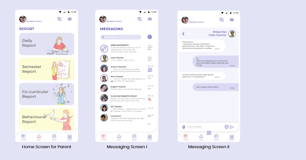
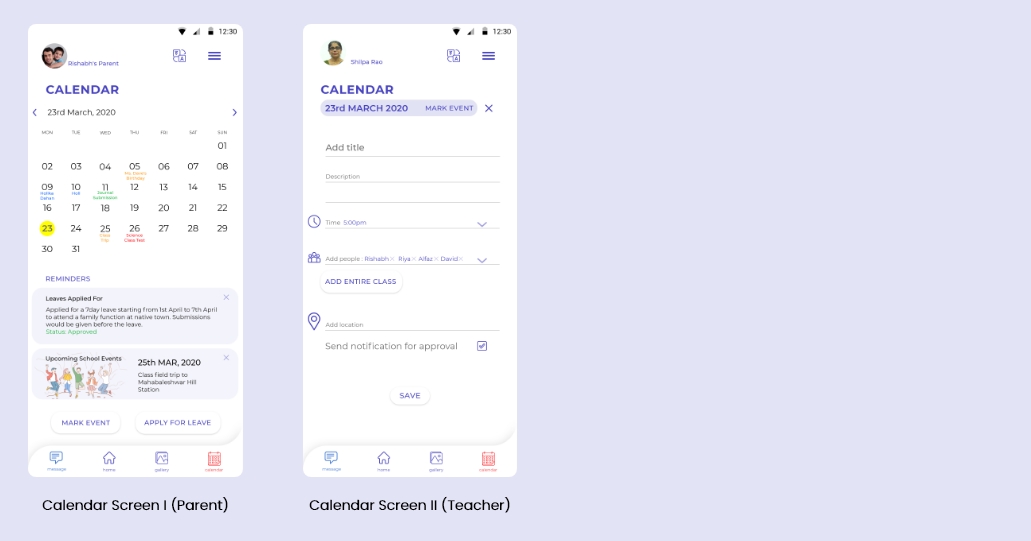
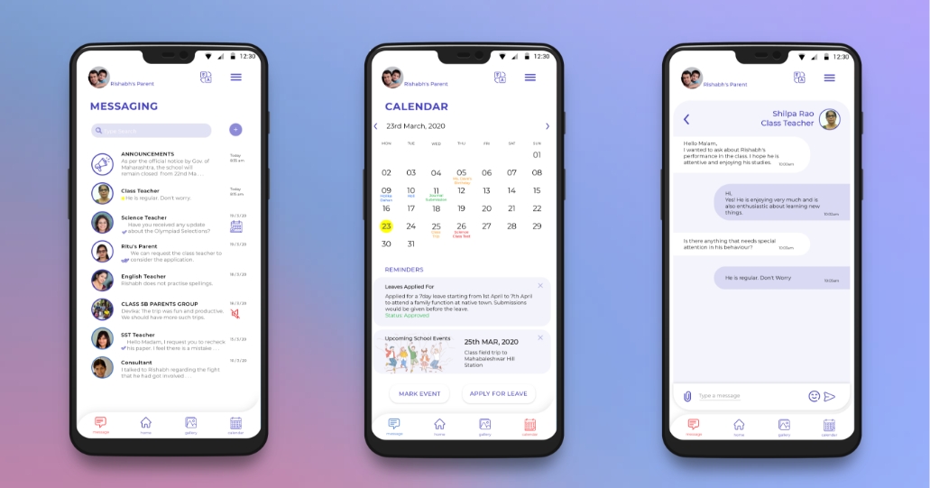
Follow Up is an app based solution for the increasing number of working parents to share homework, feedback and other inputs between teachers and parents on a day-to-day basis. My task was to design the UI for the app as part of a challenge.
Benchmarked Apps
1.Remind
2.Class Dojo
3.Edmodo
Research Findings
Important research findings
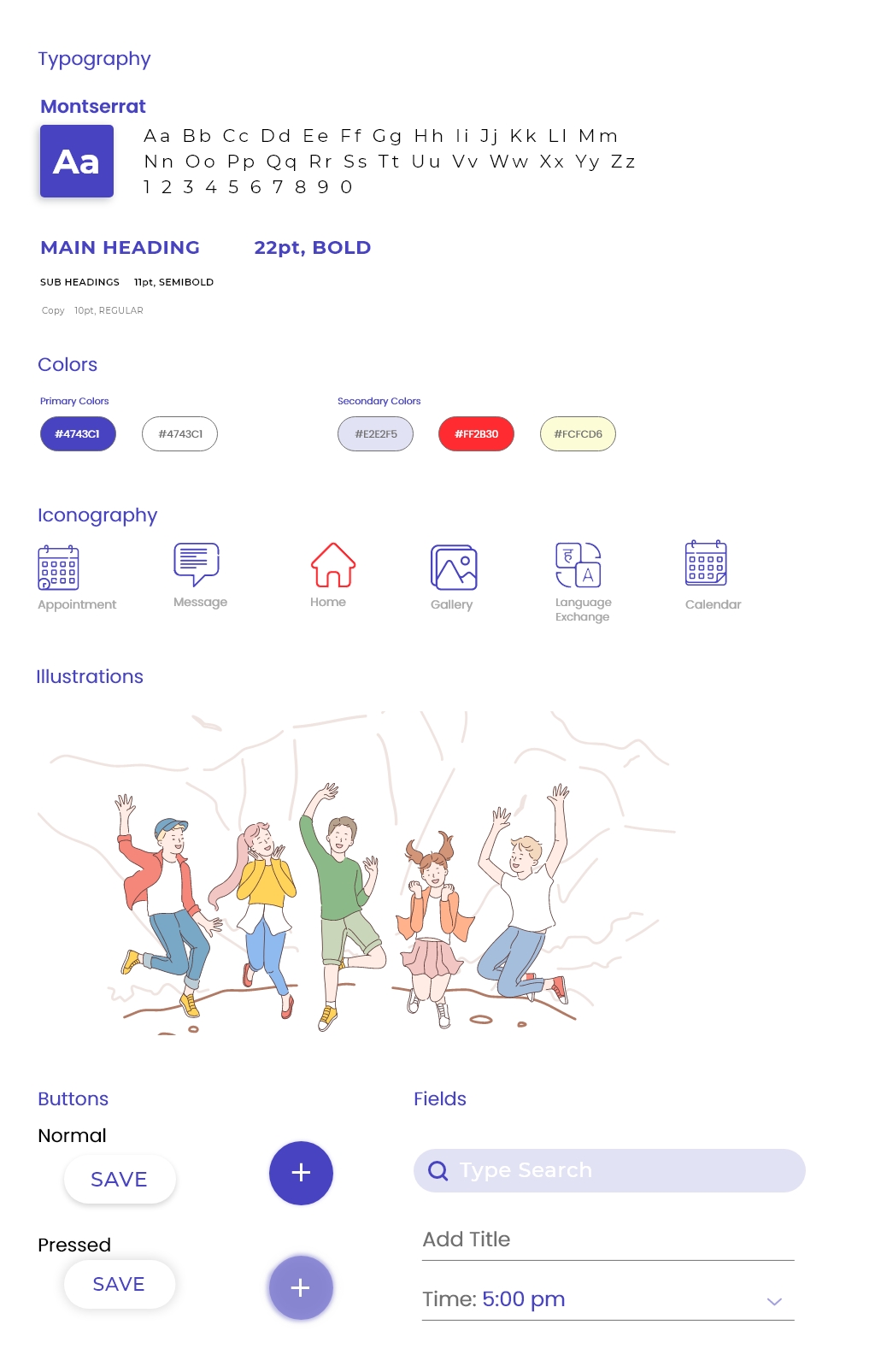
1. Target Audience : The main focus group was adults and not children. Many apps focused their visual on kids, but here the users are parents and teachers. Hence a more mature look is required.
2. Naming : The name was focused to be a verb form. It is well established that brands with a verb form name have a high recall factor.
3. Logo Design : Many apps have irrelevant or kiddish logos with high contrasting colour schemes. I chose to keep the colour scheme on the basis of 3 primary colours in a mature tone.
4. Overall Appearance : Simple UI yet inspiring conversations and interactions. A Fresh and positive attitude.
Logo

UI Decisions
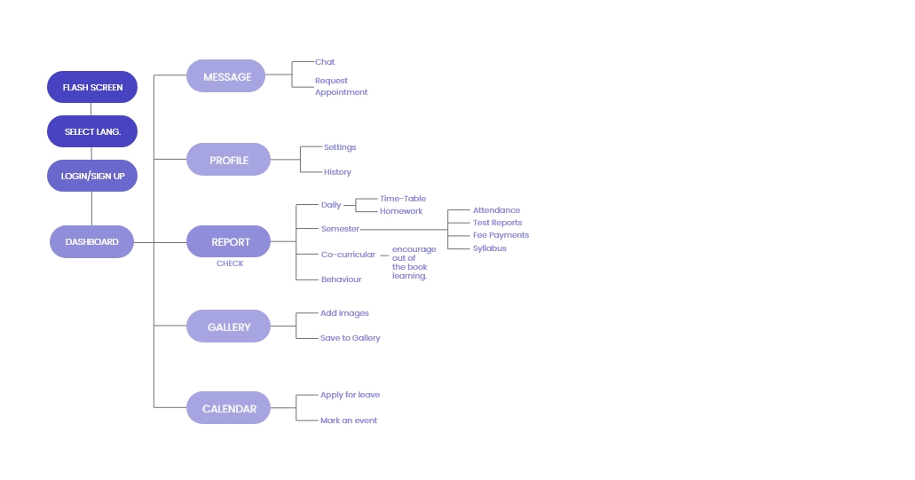
User Flow
Screens
